Deliveroo Data Analysis II
This is Part II of a 3 part series. Click here for Part I
In this section, I will do some broad, first-order analysis. No matter how we slice the data (By time-periods, cuisine or some other pattern), the first questions that spring to mind are always:
- How many orders follow this pattern?
- How much money did I spend on such orders?
Once we answer these in the aggregate, we can do a more in-depth analysis to see how these quantities trend over time, and do a comparative analysis to see how the aggregate values for different slices stack up against each other.
Table of Contents:
- Annual Consumption Trends
- Sidebar: Why are Graphs so painful?
- Annual Consumption Trends (Graphs)
- Consumption by Cuisine
- Consumption by Restaurant
- Look Ma! Bar Charts!
- Cost Analysis
Annual Consumption Trends
For starters, I simply looked at the annual data.
| Year | No_Orders | No_Items | Tot_Value | Avg Order Value |
|---|---|---|---|---|
| 2018 | 88.0 | 182.0 | 1302.60 | 14.80 |
| 2019 | 162.0 | 406.0 | 2681.01 | 16.55 |
| 2020 | 66.0 | 150.0 | 1228.76 | 18.62 |
| Total | 316.0 | 738.0 | 5212.37 | 16.49 |
Broadly speaking, not much change in consumption frequency from 2018 to 2019 (Given that 2018 was half a year worth of data). On average, I ordered in 3 times a week.
Consumption dropped in 2020, for 3 main reasons:
- Started cooking more at home.
- Ate out at restaurants/friend’s houses more than previous years.
- Ordered only once during the first 3 months of the Covid19 pandemic.
Next, I decided to plot a graph of my consumption over the course of each year.
Sidebar: Why are Graphs so painful?
Having found the total annual consumption, I wanted to plot out the consumption trends to see how they vary over time. This turned out to be more complicated than one would expect, for a variety of reasons. Since this is supposed to be a report of my journey, I thought I’d spend some time fleshing out these complications instead of jumping straight to the results.
Subjective Problems
Part of the reason I found plotting graphs difficult was because I was plotting them, and I happen to have quite a few mental and emotional hangups. The ones that are relevant here are:
My Ingratitude and Immaturity
I have incredibly powerful magical abilities that I take for granted. To be fair, this is a shortcoming I share with most of humanity - We take our visualization and graphical processing abilities for granted, and hence underestimate how hard it is to convey visual information to non-visual entities.
As an illustrative example look at the scene on your desk. Imagine having to answer a series of simple questions about this scene - Is the lamp to the right of the screen or the left? What is the color of the pen lying closest to the power outlet? Is the stack of papers thicker than the notebook? You’d most likely get a perfect score. Now imagine having to describe the scene to a friend over the phone in enough detail that they can get a perfect score on a similar quiz. Sounds daunting, doesn’t it? (By the way, this is a rigorous proof of the folklore theorem: “A picture is worth a thousand words”).
Something similar happens when we try to plot graphs on a computer. We are communicating visual information over a text channel, and hence we need to specify “obvious” things that our brain takes for granted - A simple example of is this Before picture of fig.tight_layout() - A human knows to position the graphs such that the labels don’t overlap, but matplotlib needs you to say, “Oh and by the way, please can I have a tight_layout for that fig?!”
Being slammed with unexpected bureaucracy in this way felt unfair and frustrating, and I started throwing tantrums - “Stupid matplotlib developers! Why is something as simple as plotting a graph so complicated?!” The answer, of course, is that plotting a graph isn’t that simple - I just felt that way because I have some extremely advanced visual processing machinery sitting between my ears. Eventually I understood that if I wanted graphs, I had to suck it up, be a big boy, and give the machine what it needs.
My Crippling OCD
I have strong aesthetic preferences about certain things, and find deviations physically painful - For eg. I re-wrote this meta-joke 17 different times, trying to get it just right.
While plotting these graphs, I had several tiny requirements which I spent a lot of (too much) time on:
- When plotting annual consumption graphs for 3 consecutive years, I wanted them to be stacked on top of each other, with the dates aligned. I had to edit the dataset to make sure the dates for each year went from 1 Jan to 31 Dec.
- I couldn’t choose between plotting number of orders and order value, so I decided to plot both on the same graph. However, when generating the legend, I was only able to generate the legends separately, which meant that either they overlapped and were unreadable, or you had two separate legends in two different corners of the graph, which was super ugly. Finally found a way to hack around this (Thank God for Stackoverflow!) but it should really be a standard option when plotting twinx() charts.
- The legend was covering up part of the graph. Set the ylim to be 1.2*max in order to make room for it.
- The dates on the x-axis were rotated. For some reason, these rotated dates really pissed me off, and I wasn’t getting the display intervals that I wanted. Is it that hard to label the x-axis with months? Eventually I manged to get the format of the x-axis exactly the way I wanted it, but I’m still not sure how, and don’t think I could repeat this feat.
Objective Problems
There are also some purely technical considerations that make plotting (useful) graphs harder than simply calling a Plot function on a time series.
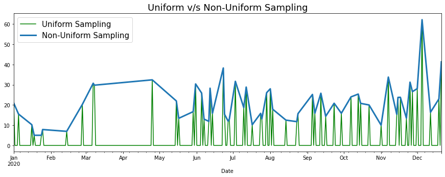
Non-Uniformly Distributed Values (Sampling)
My dataset contains points for each order that I placed, and hence is not uniformly sampled. Plotting a line graph on such a dataset could result in some funky looking graphs. When you use a line chart, it will linearly interpolate missing data points, which gives a weird trend line. For eg. it is NOT the case that order activity linearly increased from March to May in the below graph.
This can be addressed by re-sampling the data into uniformly spaced buckets; For eg. Each day is a bucket and orders for that day feed into that bucket. Days with no orders get assigned zero. This graph correctly shows periods of no activity.
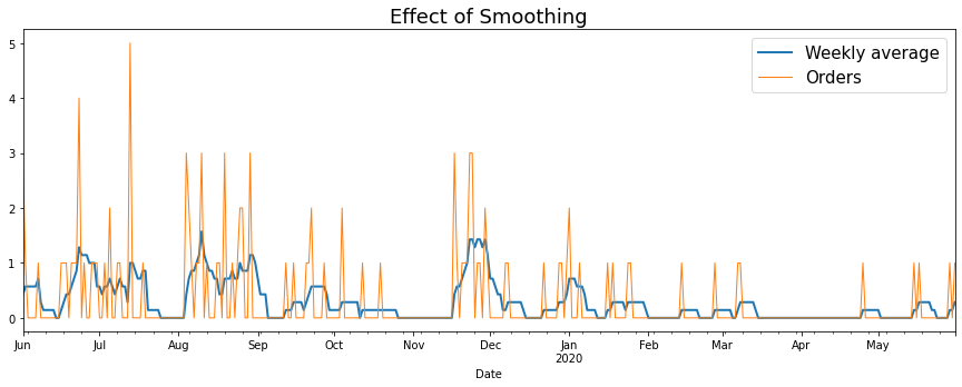
Discontinuous Jumps (Smoothing)
Resampling the data gives a more accurate representation of order activity, but the resulting graph looks a bit like hedgehog roadkill. A smoother graph would give a better indication of how order activity trends over a period of time.
Signal smoothing is done with low pass filters, which is just a fancy way of saying you need to mathematically transform the series in a way that damps down the effect of short term fluctuations and pronounces longer term trends (Woah! Looks like the Control Systems course I took in college wasn’t a complete waste of time!)
One particular way to achieve this is to sum order activity over a lookback window - This also has the advantage of being easy to interpret (Order activity in the past ‘n’ days). How to pick ‘n’ in a general scenario is an important question, and hedge funds like WorldQuant hire legions of smart undergrads to try every possible option employ advanced statistical methods to figure it out. In this case however, I just chose a lookback period of one week, because:
- Food delivery behaviour is roughly periodic over this time period (Tend to order more on the weekends etc). Hence variations on top of this baseline predictability will give us maximal informational payload.
- Order frequency is typically at least 1 per week; If you pick a look back whose length is less than the average space between orders, there will be no smoothing effect.
Important Note: One last thing to observe from the graph below is that the smoothed graph isn’t strictly better, as it sometimes omits juicy details. For eg. On 13 July 2019, I had 5 orders on the same day!
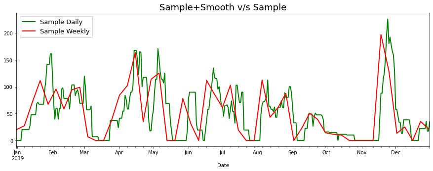
Sampling + Smoothing?
I’m all about saving effort, and so the natural next thought was: What if, instead of resampling data into daily buckets and then smoothing it out using a weekly window, I just resampled into weekly buckets? As you can see the weekly sampled graph excludes a fair bit of detail, so I decided the short cut wasn’t worth it.
Annual Consumption Trends (Graphs)
Putting together all the knowledge from the previous section, I was in a position to plot the graphs tracking the local consumption trends in each year. I wasn’t sure about whether to use order value or number of orders as my consumption metric, so I went with both (As I explain below, their interplay also allows us to make some interesting inferences).
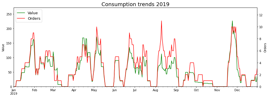
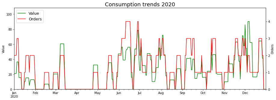
What do the graphs tell us?
-
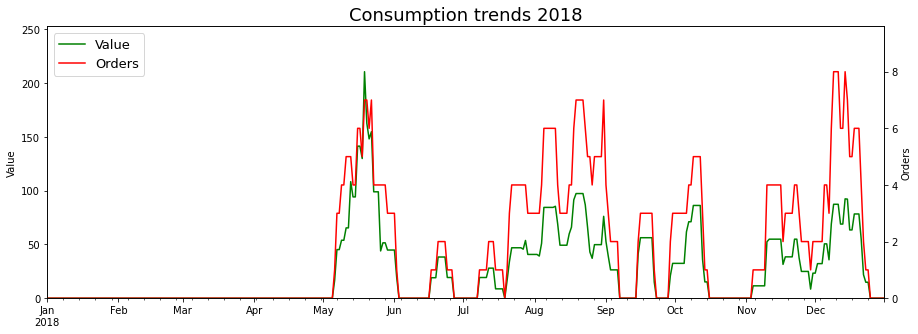
Going by the scales of the y axes, the weekly consumption dropped in 2020 (In terms of both, the average and the peak value).
-
The valleys with zero orders correspond to the times that I was on vacation, or my parents were visiting. The longest period of time without orders was from mid-March 20 to late April 20, which is when Covid19 first went viral (sorry) in the public imgaination.
-
The scales of the Value and Orders chart are such that the Orders line (Red) is, in most cases, above the Value line (Green). Hence, the instances where the green line crosses the red line correspond to particularly large orders, when I had guests over (For eg. start Mar 2019, end Apr 2019, mid Nov 2019, start Dec 2020)
Note that the Value chart has roughly the same height in end April 19 and start May 19, but it’s clear that the Value in May came from several orders and was just me pigging out for whatever reason.
Consumption by Cuisine
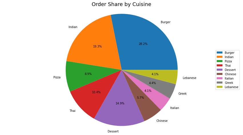
The next logical prism to split the data is Cuisine. For starters, what is the distribution of cuisine preference?
| Cuisine | OrderNo | Value | Value Per Order |
|---|---|---|---|
| Burger | 89 | 1542.18 | 17.3 |
| Indian | 61 | 1151.30 | 18.9 |
| Pizza | 28 | 646.34 | 23.1 |
| Thai | 33 | 586.90 | 17.8 |
| Dessert | 47 | 367.05 | 7.8 |
| Chinese | 18 | 307.90 | 17.1 |
| Italian | 13 | 231.60 | 17.8 |
| Greek | 14 | 199.40 | 14.2 |
| Lebanese | 13 | 179.70 | 13.8 |
And the same data in pie chart format (As one can see, there is a fair bit of variance in the Value per Order for different cuisines, so Order share seemed like a more democratic metric to compare). Looks like Burgers and Indian food account for about 50% of my consumption!
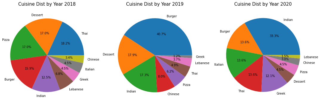
Cuisine Distribution over Time
I wanted to see how the distribution of various cuisines has varied over time, so plotted the following charts: My cuisine preferences appear to be pretty dynamic! However, this is probably a result of external factors rather than my personality changing from year to year. One such factor is the availability of restaurants on Deliveroo; If Shake Shack delivered to my house in 2018, I’m pretty sure burgers would be the chart-topper that year as well.
Restaurants by Cuisine
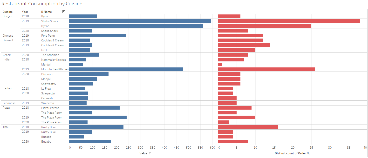
One simple question to ask in this regard is, what is the favourite restaurant for each cuisine? As the pie charts above show, ordering behaviour is quite dynamic over time, so it makes sense to look at the favourite restaurant per cuisine per year. (I aggregated over Value in this case, since restaurants with the same cuisine would have prices closer to each other.)
| Year | 2018 | 2019 | 2020 |
|---|---|---|---|
| Burger | Byron | Shake Shack | Shake Shack |
| Chinese | Grilled Fusion | Ping Pong | |
| Dessert | Cookies & Cream | Cookies & Cream | Craving Dessert |
| Greek | The Athenian | The Athenian | The Athenian |
| Indian | Namma by Kricket | Motu Indian Kitchen | Dishoom |
| Italian | La Figa | Scarpetta | |
| Lebanese | The Chickpea | Waleema | Efes |
| Pizza | PizzaExpress | The Pizza Room | The Pizza Room |
| Thai | Rusty Bike | Rusty Bike | Busaba |
Also included a fancy Tableau graph of this data, since just showing the max value restaurant hides close runners up (As is the case with Byron and Shake Shack in 2019).
Consumption by Restaurant
Next, I broke down the data by restaurant. Here again, I looked at the overall total, and then looked at the distribution on a year by year basis.
| rName | OrderNo | Value | Avg Value |
|---|---|---|---|
| Shake Shack | 47 | 707.40 | 15.1 |
| Byron | 31 | 679.30 | 21.9 |
| Motu Indian Kitchen | 32 | 565.75 | 17.7 |
| The Pizza Room | 18 | 419.54 | 23.3 |
| Rusty Bike | 21 | 346.10 | 16.5 |
| Busaba | 12 | 240.80 | 20.1 |
| Ping Pong | 12 | 238.25 | 19.9 |
| PizzaExpress | 9 | 212.25 | 23.6 |
| The Athenian | 14 | 199.40 | 14.2 |
| Cookies & Cream | 27 | 192.15 | 7.1 |
| Manjal | 7 | 177.95 | 25.4 |
| Dishoom | 6 | 166.20 | 27.7 |
Restaurant Distribution over time
The pie charts below the order share of restaurants per year. I only included restaurants with > 5% order share to keep things readable.
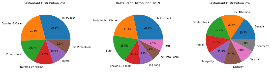
I don’t know if someone who doesn’t know me could figure out much about me from the charts above, but they make a lot of sense to me given what I know about myself.
2018: I first moved to London, and had a hankering for Indian food (Namma by Kricket) and ordered a lot from Pizza Express (The power of brand recognition). Namma by Kricket shut shop within a couple of months (The power of a really bad name) and Rusty Bike became my go-to for simple, not-too-unhealthy food. Once I discovered Pizza Room, I entirely switched over to them for all my pizza needs. Cookies and Cream was the generic cake shop closest to my house.
2019: Early 2019 was a wild time. Two of my favourite restaurants, Shake Shack and Ping Pong started delivery to my house. Unfortunately, I moved houses and Ping Pong no longer delivered to my new house, which explains the 8.9% above. Also, Byron launched a veggie burger (Limited edition though), which meant I ordered from them a lot more. Motu was another one of the new entrants at this time - They had a Box for 1, which was strictly average in quality but sated my desire for Indian food. Dzrt was the generic cake shop closest to my new house.
2020: Two cataclysmic events occurred in late 2019; A Chinese dude ate a bat sandwich and I got a new flatmate. My flatmate didn’t enjoy burgers as much as I did, which meant a drastic reduction in Byron + Shake Shack. Also, the pandemic seemed to affect Byron particularly badly (If Lord Byron is reading this, check out Section 3 for some ideas to increase business). The preponderance of Busaba can be attributed to my flatmate, while Capeesh was all mine. We both got behind the Athenian (Halloumi Souvlaki), Manjal (Uthappa aka Savory South Indian rice pancakes) and Scarpetta (Pasta for her, grilled chicken+veggies for me). Due to the lockdown, Dishoom finally entered the food delivery game in the later part of the year. Another pandemic baby was Chowpatty, an upstart, home-run ‘restaurant’ that delivered Bombay street food (Complete with raw mango garnish).
Look Ma! Bar Charts!
Honestly, this section is just me flexing my newly developed plotting muscles…
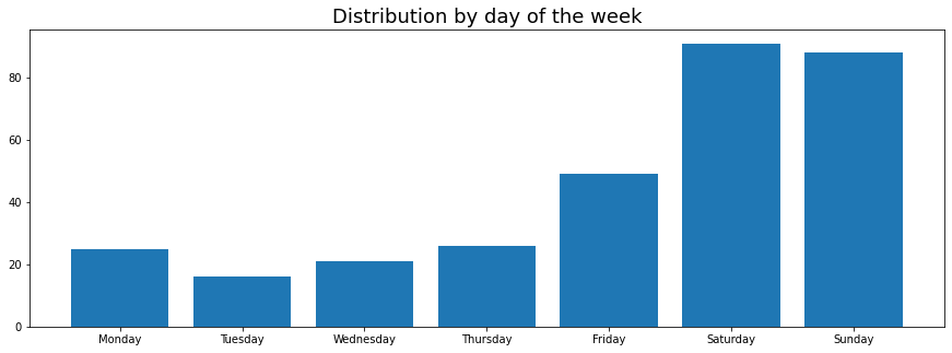
Unsurprisingly, most of the food is ordered on the weekends. But why stop here? Let’s take a look at:
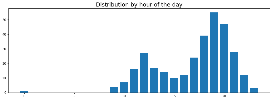
Another anti-surprise, most of the food ordered during lunch and dinner, with more dinner orders than lunch orders. And because we live in an age of cheap compute, I decided to also plot…
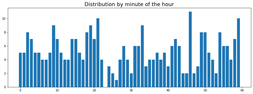
OHMYGODOHMYGODOHMYGOD!!! No orders during the 23rd minute!!! Clearly I’m living in a movie…
Cost Analysis
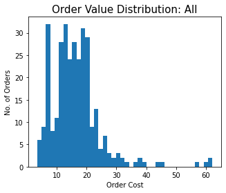
As calculated before, my total spend on Deliveroo so far is £5212.37, which works out to £87 per month on average.
Distribution of Order Values
The average price of an order is £16.49 and the median is £15.77. I’ve plotted the distribution below, and it’s pretty obviously multimodal - For eg. The large concentration of orders at about £8 corresponds to the dessert orders. One can also see the larger orders when I ordered for a group of people (Seems like there were at least 7/8 such occasions).
Is my Deliveroo Plus Account worth it?
This calculation is very hard to do super accurately, since the rules of the game keep changing. For eg. in Jan 20, Deliveroo introduced a £10 minimum order value to avail free delivery. The delivery fee structure is also pretty complicated, though Deliveroo states that on average, it is about £2.5. I have no idea how that number has changed over time though - Most of my email receipts before subscribing to Plus state the delivery fee is £0, which makes me wonder why I subscribed in the first place. To cut a long story short I will proceed with the following assumptions - Delivery fee would have been £2.5 without Plus, and the £10 threshold applies to all orders.
I started my Plus subscription in October 2019. At the time, it cost £7.99 per month (Increased to 11.49 per month in December 20). Over 15 months, this is a total spend of £123.35.
Over the same period of time, I had 80 orders that cost more than £10. This translates to savings on delivery fees of £200, and net savings of £66.65 (So close!) or a princely sum of £4.44 per month. At the present cost of Plus, the net savings would be less than £2 per month.
It would be nice if Deliveroo themselves could do this calculation for you. Obviously, they wouldn’t want to show you that info if it turns out your Plus membership is actually a net negative for you, and I don’t think it would be acceptable for them to only show this statistic to people who benefitted from Plus.
Hence, the only way such a feature could work is if they showed people who don’t have Plus how much they would have benefitted with Plus given their order history - “If you had signed up for Plus in Oct 2019, and used the savings to purchase long-dated Gamestop options, today you’d have a 1000 Dogecoins!”. Of course, this is assuming that Deliveroo is actually incentivized to convert such customers to Plus; I’ve no idea how the economics on that works.
Most Expensive Restaurant
This should be an easy one, right? The most expensive restaurant is the one that costs the highest price per unit of food, which seems straightforward enough. Unfortunately, the hard part of using that formula is defining a ‘unit of food’. Do we define an order to constitute 1 unit? This doesn’t seem right, as we will see in the analysis of individual restaurants, order sizes can be quite variable even for orders from the same restaurant (Due to guests for example).
How about defining a unit of food to be one restaurant item? This is even more problematic, because items can fall into various categories - Mains, Sides, Pizzas (Yes, pizza is a separate category!), Drinks, Desserts etc. and are hence even less uniform than orders. There might be a path here if we manage to categorize the items, and take some sorted of weighted sum across categories (1 Side = 0.5 Units, 1 Main = 1 Unit, 1 Pizza = 1.5 Units etc.) but the categorization is a challenge in it’s own right (That I explore in the restaurant level analysis).
Another approach would be to go full Physics and define food units in calories, but caloric information doesn’t exist for most of these items - Hit me up if you can think of a not-too-hard, non-manual way to come up with approximate calorie counts for the items! Also, caloric count isn’t proportional to satiety - The calorie approach would be biased against desserts, but that is just an argument for why desserts should be their own category.
In the absence of clear answers, I decided to just calculate the 2 simplest metrics (Average Order Value and Average Item Value), and see which one made more sense.
| rName | Average Item Value |
|---|---|
| Motu Indian Kitchen | 11.55 |
| The Pizza Room | 10.76 |
| PizzaExpress | 10.61 |
| Busaba | 8.30 |
| Cookies & Cream | 7.12 |
| Manjal | 7.12 |
| The Athenian | 6.88 |
| Dishoom | 6.65 |
| Rusty Bike | 6.41 |
| Byron | 6.01 |
Off the bat, we can see that Item Value as a metric is giving nonsensical results - The top 3 items have Pizza restaurants (As predicted) and Motu Indian Kitchen, which has the massive “Box for 1” as a single item, but is hardly an expensive/high class restaurant. The other entries on the list are equally nonsensical (The Athenian? Rusty Bike?? Cookies & Cream???)
| rName | Average Order Value |
|---|---|
| Dishoom | 27.70 |
| Manjal | 25.42 |
| PizzaExpress | 23.58 |
| The Pizza Room | 23.31 |
| Byron | 21.91 |
| Busaba | 20.07 |
| Ping Pong | 19.85 |
| Motu Indian Kitchen | 17.68 |
| Chowpatty | 17.11 |
| Rusty Bike | 16.48 |
This seems more in line with the truth, but again there is a very evident bias - All of Dishoom, Manjal and PizzaExpress have instances of large (> £60) orders, which skew their average order value upwards.
Another point in favour of the order metric - This list features the fancier places like Ping Pong, Busaba, and Byron higher up than the first list.
In order to see the restaurant-wise analysis analysis, check out Section III!